


 FanExtra Membership:
Sign up today for a FanExtra membership, and get access to hundreds of PSDFAN tutorial source files, weekly members-only tutorials, vectors, icons and design-related discounts.
Promote this Post:
We'd really appreciate it if you took a moment to help promote this post. Your efforts help keep this site running.
5
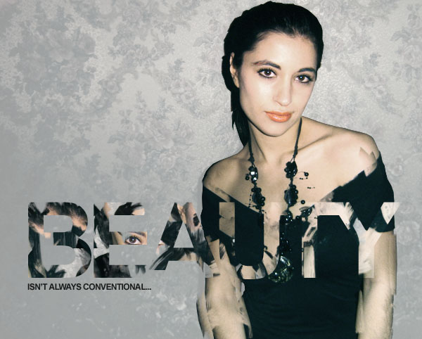
Final Image
This is the final image that we will be creating:

Images Used
This following images are used in the making of this tutorial:
Step 1
Start by opening up your photo of a female model. As you can see, it’s incredibly different from our final outcome. This tutorial will focus heavily on manipulating/improving your photos.

Step 2
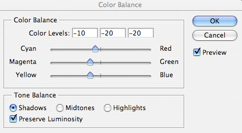
Currently the photo is looking far too red. To fix this go to image>adjustments>color balance, and apply the settings shown below:


Step 3
Now cut out your woman from the background. Use whatever tool you prefer for this step, but personally I work quickest with the lasso tool (many people prefer the pen tool). Either way, cut around your woman, and then hit copy+paste to paste your selection onto a new layer.
The image below shows your new isolated woman layer, with your original photo layer hidden.

Step 4
Now we want to make our main background a light gray color. To do this, select your original photo layer and go to image>adjustments>hue/saturation. Reduce your saturation to -80 and increase your lightness to +60. This will not effect how your woman looks, as she has been isolated on a new top layer.


Step 5
I noticed that the arms of the woman are looking a little greener than her shoulder and face, and therefore apply another set of color balance adjustments to just her arms. To do this, select around her arms, and with your selection in place go to image>adjustments>color balance. The fact that your selection is active when making these color adjustments will mean that only data inside your selection will be affected.


Step 6
Now select your woman layer and select around her eyes, lips and eyebrows, pasting each onto a new layer. Then merged together all of these seperate layers, leaving with one layer containing all of these facial details. Below you can see the data of this layer identified, as I have hidden the ‘woman’ layer, but left this new layer and my desatured background layer visible.

Step 7
Now select your ‘woman’ layer and go to image>adjustments>hue/saturation. Reduce your saturation to -50. You can see the result of doing this below.


Step 8
Now to give some more intensity to your photo. Duplicate your ‘woman’ layer and chance the duplicates blend mode to ‘hard light’. Then reduce this layer’s opacity to 20% and merge it down with your original ‘woman’ layer (option+e). Then duplicate your facial details layer and set the blend mode to ‘hard light’. This time reduce the opacity of this layer to 50%, and again, merge down with your original layer. This should not only give your overall photo more intensity, but make your facial details more prominent than the rest of the photo. This is important as we want them to attract more attention.

Step 9
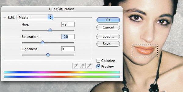
I wasn’t totally happy with the color of the woman’s lips, so I select my facial details layer, and select around her lips using the rectangular marquee tool. Then go to go hue/saturation settings and apply the settings shown below:
Step 10
Now go to layer>flatten image. Once your layers have been flattened, select this flat image and hit ‘copy’. Then go to your history palette and undo the layer flattening action. Then, once you have all of your original layers back in tact, past your copied image as a new top layer.
The image below shows my layers palette, and explains this step more clearly:

Step 11
Now type some very large text on a new top layer. I went with Arial (bold), size 150pt, -100 kerning. You can use any color you want for your text.

Step 12
Now the creative bit! Select your ‘flat image’ layer, and grab your clone stamp tool.
Notice that once you have selected your clone stamp tool you can select a brush to use with the tool. I selected a watercolor brush set, and used most of the brushes from the set in this step. You can find many good watercolor brush sets online, or simply use a rough default brush in Photoshop.
Hide your text layer, and then begin cloning parts of your flattened image, pasting the cloned data in the areas where your text is positioned. You want to make this as messy as possible, by cloning parts of your image furthest away from this area. For instance, try cloning parts of your woman’s face and hair and pasting them over her body.
Remember: To use the clone stamp tool simply alt+click on the area of your image that you want to clone, then release alt and click to paste in the cloned data.
You want to paste cloned data over most of the areas where you text is positioned, so in this case we need to paste in this cloned data over the woman’s chest, and also out to her right, over our light gray background. To make this technique most effective, try pasting darker data over the light background, and lighter data over the woman’s dark top.
You can see my results below:

Step 13
Now go to your layers palette and option+click on your text layer to select all data on this layer. Once you have a selection in the shape of your text, hide your text layer and return to your flattened image layer (containing all your clone stamp tool work). Then, with your selection still active go to layer>apply layer mask>reveal selection.


Step 14
Now go to blending options for your flattened/masked layer and apply a gradient overlay. Set your gradients angle to 0 degrees, and choose a gradient ranging from transparent to white. Then change the gradients blend mode to ‘overlay’ and reduce it’s opacity to 50%. This will give a little more impact to your text.


Step 15
Now return to your original ‘woman’ layer. Duplicate it. Then select your clone stamp tool and begin cloning areas of the bottom part of the woman. Be sure to clone parts of her, and then paste the cloned data a few pixels to the side of the original area. This will create a very dismantled look.
By applying this technique only to the bottom half of your woman photo you give the impression of the woman dismantling gradually, and the effect combines nicely with your text.

Step 16
To help my composition I add a quick tagline below my main text. I use Arial again, size 12pt font.
Step 17
Now select the smudge tool, and set it’s strength to 100%, size to 1px. Start by selecting your flattened/masked layer, and create very grungy, rough 1px lines all over your text by smudging data within this layer.
Then select your duplicated woman layer (the one with cloned arm parts), and repeat this technique. Smudge out rough lines from the woman’s hair, to create a mass of dark, grungy looking lines.

Step 18
Now download this great free Splatter Brush Set. Make sure that you’re on your duplicated woman layer (the layer we’ve just been smudging her hair on), and then apply brushes from this brush set at random next to her head. You want to try and be quite messy with this.

Step 19
Now create a new layer called ‘highlight’ above your duplicated woman layer. Make one large, soft, yellow brush mark overlapping parts of her hair and the ink splatters next to her head. Then alt+click on your duplicate woman layer in your layers palette, and with your highlight layer still selected go to layer>apply layer mask>reveal selection. Then reduce your highlight layer’s opacity to 60%.


Step 20
Now create a new layer just above your light gray background layer called ‘radial gradient’. Drag out a white to transparent gradient from the center of your canvas. Then reduce this layer’s opacity to 35%.

And We’re Done!
To finish up I just added a few low opacity watercolor brush marks over my piece.
About the Author:
Tom is the founder of PSDFAN. He loves writing tutorials, learning more about design and interacting with the community. On a more interesting note he can also play guitar hero drunk with his teeth.
FanExtra Membership:
Sign up today for a FanExtra membership, and get access to hundreds of PSDFAN tutorial source files, weekly members-only tutorials, vectors, icons and design-related discounts.
Promote this Post:
We'd really appreciate it if you took a moment to help promote this post. Your efforts help keep this site running.
5
Related Posts
 Members Area Tutorial: Create a Print-Ready Business Card in Illustrator
 Design a Space Inspired Iphone Advert
 Create an Abstract Sea on Land Illusion
thanx
Gretings from Croatia
Thanks for this great tutorial. I followed it and I made something similar (different but with your glare in it
Here it is: http://sdt.si/learning/tamara1.jpg
Matic
Muchas gracias por compartir
Thanks for this. keep up the good work
Thanks John
I personally liked it up to step 17.
thankyou for sharing